WPF TabControl transition effects with Transitionals
Transitionals is a WPF framework that allows you to integrate nice transition effects into your WPF application with very little effort. It’s gone live a few days ago on CodePlex and definitely worth checking out:
http://www.codeplex.com/transitionals
I’ve downloaded the library today in order to incorporate a little eye candy into a prototype I’m doing. However, what I wanted to do was adding transition effects on a tab control, which is currently not supported out of the box by the framework:
Currently Transitionals ships with only two controls out of the box […]. Other controls, like a Tab control for example, could also be created. We encourage the community to come up with other common navigation and presentation scenarios that can leverage transitions.
This sounded like a lot of work, but luckily, it wasn’t: TabControl provides a ContentTemplate property which can be bound to a data template. This is were I put a TransitionElement control and bound it to the current content of the tab control:
<DataTemplate x:Key="TabTemplate">
  <t:TransitionElement Content="{Binding}">
    <!-- some more stuff -->
  </t:TransitionElement>
</DataTemplate>

<!-- tab control with content template -->
<TabControl ContentTemplate="{StaticResource TabTemplate}" />
These bindings take care of everything – a tab switch changes the content of the TransitionElement, which triggers a transition animation. All that was left to do was configuring a transition effect and adding some content to the tab control. Here’s the complete listing that uses a 3D rotation effect:
<Grid>
  <Grid.Resources>

    <!-- the data template binds the content to a transition element -->
    <DataTemplate x:Key="TabTemplate">
      <t:TransitionElement Content="{Binding}">
        <!-- rotate tab contents -->
        <t:TransitionElement.Transition>
          <trans:RotateTransition Duration="0:0:1.500"
                                  Angle="90" />
        </t:TransitionElement.Transition>
      </t:TransitionElement>
    </DataTemplate>

  </Grid.Resources>


  <TabControl ContentTemplate="{StaticResource TabTemplate}">

    <TabItem Header="First">
      <!-- some content -->
    </TabItem>

    <TabItem Header="Second">
     <!-- some content -->
    </TabItem>

  </TabControl>

</Grid>
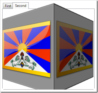
My sample contains two tabs which both display the same image. Accordingly, the code snippet above produces the following 3D effect when switching tabs:


