Microsoft WPF DataGrid vs. Commercial Solution: 1:0
I’ve never been really happy with the commercial data grid I’ve been using so far – the whole API felt somewhat “winformish”, and required my to write a lot of XAML or even code for even the most basic tasks.
Today, I needed a simple grid on one of my current projects, and immediately got annoyed by the same issues that bug me every time. With the difference that this time, I had a new alternative to look at – Microsoft’s Data Grid that went V1 this October.
Well: This is an amazing control. It’s not amazingly powerful, it doesn’t have amazing animations, amazing views or anything like that. There is just one thing: It gets the job done.
Here’s my top 3 in comparison to my commercial product:
1: Data Binding
Finally I have data binding the way I always thought it should be. No more dealing with the internal data representation of the grid, and 2-way-data binding to selected items (not records or rows) out of the box. I didn’t even have to look up the API – it’s just as I expected it to be. Loving it:
<dg:DataGrid
  x:Name="platforms"
  ItemsSource="{Binding Path=Track.Platforms, ElementName=me}"
  SelectedItem="{Binding Path=ActivePlatform, ElementName=me}">

<!-- column definitions -->

</dg:DataGrid>
2: Liquid (Star-Sized) Columns
To my great surprise, I can easily star-size columns to take the full available horizontal space of the grid. This is a feature I need as good as every time I use a grid. With my commercial product, I was forced to write a whole layout template in order to get there. Not anymore:
<dg:DataGrid.Columns>
  <!-- fixed size column -->
  <dg:DataGridTextColumn
    Header="Name"
    Width="60"
    Binding="{Binding Path=ItemName}" />
  <!-- takes 2/3 of the remaining space -->
  <dg:DataGridTextColumn
    Header="Description"
    Width="2*"
    Binding="{Binding Path=Description}" />
  <!-- takes 1/3 of the remaining space -->
  <dg:DataGridTextColumn
    Header="Position"
    Width="*"
    Binding="{Binding Path=StartPosition}" />
</dg:DataGrid.Columns>
3: Styling
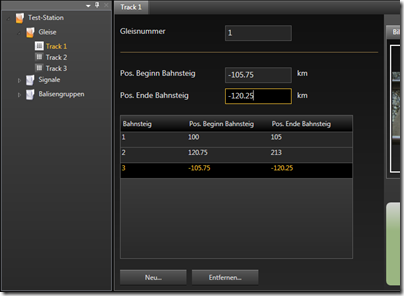
I really do like some of the carefully crafted themes of my commercial grid. But on the other hand, customizing it was a major pain, so styling was one of my main concerns. However, the MS grid is amazingly flexible and easy to use for a v1.0 solution.
In the end, I’m happier with my custom-styled result than the predefined theme of my commercial grid – simply because the custom style blends in perfectly with the rest of the UI:


Conclusion
I’m pretty sure that the commercial – and definitely more powerful – solutions have their rightful place on the market, but Microsoft’s grid really fills a gap for me here – especially because of the API that just keeps things simple.
I can’t help but think that the vendors that were the first ones on the market may be last in the long run. At least the API of the grid I used so far just doesn’t cut it for me. We all had to get (are still getting) acquainted to “thinking in WPF” and some of the “mature” solutions just give me the impression that their basic concepts have “Windows Forms” written all over them. And with regards to compatibility, it might get pretty hard to get rid of that. That is, however, just my 0.02$.
Go get it @ CodePlex: http://www.codeplex.com/wpf

