Archive

Archive for the ‘WPF’ Category

Format WPF Bindings With Resource File Lookups

March 21st, 2009

This post explains a pattern that combines Data Binding, the new StringFormat property and resource lookups through the application of a custom MarkupExtension.


StringFormat

Microsoft introduced the StringFormat property with SP1 for .NET 3.5. StringFormat often eliminates the need for a custom converter if you just need to format a bound value.
Here’s a very simple sample that displays hello xxx on the screen (where “xxx” is the value entered in a TextBox control:


<TextBox
    x:Name="name"
    Text="world" />

<TextBlock
    Text="{Binding ElementName=name,
                   Path=Text,
                   StringFormat=hello {0}}" />


Resource Files

I often use resource files to store strings – not only for localization tasks but also in order to maintain strings that are intended for users at a central place. My resource strings often contain placeholders which are populated at runtime using String.Format:


image


//use resource file to create message
var msg = Resources.Ask_Whether_To_Connect_To_New_Share;
msg = String.Format(msg, configuration.Name);

//display dialog
MessageBoxResult doConnect = Dialogs.ShowYesNo(msg);


Bringing Bindings and Resource Files Together

In the sample above, I accessed the resource file programmatically. In XAML however, I prefer a declarative approach. In order to get there, I implemented a simple MarkupExtension that allows me to do just that:


<!-- Display a formatted text --> <TextBlock x:Name="Title" Text="{Binding Path=Name, StringFormat={ext:Resource Ask_Whether_To_Connect_To_New_Share}}"

/>


The above snippet results in a formatted text being displayed:

image


Resource MarkupExtension

Here’s the markup extension. As you can see, it’s fairly trivial. Do note that the reference to the application’s Resources file is hardcoded – you will have to set a using statement or adjust that line in order to use your custom resource file.


/// <summary>
/// A markup extension that provides simple access to a given
/// entry in the application's <see cref="Resources"/> file.
/// </summary>
public class Resource : MarkupExtension
{
  /// <summary>
  /// The resource key to be used for the lookup.
  /// </summary>
  public string ResourceKey { get; set; }


  /// <summary>
  /// Inits the <see cref="Resource"/> markup extension
  /// with the key to be assigned.
  /// </summary>
  /// <param name="resourceKey">The resource key to be assigned.</param>
  public Resource(string resourceKey)
  {
    ResourceKey = resourceKey;
  }


  /// <summary>
  /// Performs a lookup for the defined <see cref="ResourceKey"/>.
  /// </summary>
  /// <returns>
  /// The value of the resource that is specified by the
  /// <see cref="ResourceKey"/> property. If the property is not
  /// set, a null reference is returned.
  /// </returns>
  public override object ProvideValue(IServiceProvider serviceProvider)
  {
    if (String.IsNullOrEmpty(ResourceKey)) return null;
    return Resources.ResourceManager.GetObject(ResourceKey);
  }
}


Enjoy 🙂

Author: Categories: WPF Tags: ,

ComboBox SelectedItem and ItemsSource: Order Matters

January 14th, 2009

A co-worker of mine had a strange issue with a bound combo box that looked like this: 

<ComboBox
  x:Name="cboParentUser"
  ItemsSource="{Binding Path=Order.Store.Users, ElementName=me, Mode=Default}"
  SelectedItem="{Binding Path=Order.ParentUser, ElementName=me, Mode=Default}"
  IsEditable="False"
  DisplayMemberPath="UserName" />


As we could observe at runtime, selecting an item in the combo box properly updated the underlying ParentUser property. Furthermore, we could easily exchange the data context (Order dependency property) in order to edit different items.

However: As soon a the editor control that contained the combo box was unloaded, the ParentUser property of the currently edited Order was set to null, so all previously made adjustments were lost.

The reason behind this behavior seems to be the fact that both ItemsSource and SelectedItem are bound to the same dependency property: Apparently, when Order is set to null during unloading, WPF realizes that the ItemsSource is no longer valid, and therefore clears the SelectedItem, to which the combo box still appears to hold a reference at this moment – which brings it down to a question of proper coercion. Or maybe not – the reason behind this is not entirely clear to me.

However: Changing the declaration order of SelectedItem and ItemsSource fixes the problem:

<ComboBox
  x:Name="cboParentUser"
  SelectedItem="{Binding Path=Order.ParentUser, ElementName=me, Mode=Default}"
  ItemsSource="{Binding Path=Order.Store.Users, ElementName=me, Mode=Default}"
  IsEditable="False"
  DisplayMemberPath="UserName" />


And yes: This does feel like a dirty hack.

Author: Categories: WPF, WPF Controls Tags: ,

Using Attached Properties to Create a WPF Image Button

January 7th, 2009

Today I came across a nice blog post that described how to create a WPF image button with three different approaches. I’ve always taken an alternative route using attached properties, so here’s a short tutorial that complement’s the techniques outlined on Max’ Blog:


 image


Basically, the work to get there consists of two parts:

  • Declare an attached property that gets an image source.
  • Create a style (or multiple styles) that makes use of the attached property in order to display the image.


Attached Property

There’s nothing special here – I just declared an attached property named Image, which is of type ImageSource.


using System.Windows;
using System.Windows.Media;

namespace Hardcodet.Wpf.Util
{
  public class EyeCandy
  {
    #region Image dependency property

    /// <summary>
    /// An attached dependency property which provides an
    /// <see cref="ImageSource" /> for arbitrary WPF elements.
    /// </summary>
    public static readonly DependencyProperty ImageProperty;

    /// <summary>
    /// Gets the <see cref="ImageProperty"/> for a given
    /// <see cref="DependencyObject"/>, which provides an
    /// <see cref="ImageSource" /> for arbitrary WPF elements.
    /// </summary>
    public static ImageSource GetImage(DependencyObject obj)
    {
      return (ImageSource) obj.GetValue(ImageProperty);
    }

    /// <summary>
    /// Sets the attached <see cref="ImageProperty"/> for a given
    /// <see cref="DependencyObject"/>, which provides an
    /// <see cref="ImageSource" /> for arbitrary WPF elements.
    /// </summary>
    public static void SetImage(DependencyObject obj, ImageSource value)
    {
      obj.SetValue(ImageProperty, value);
    }

    #endregion

    static EyeCandy()
    {
      //register attached dependency property
      var metadata = new FrameworkPropertyMetadata((ImageSource) null);
      ImageProperty = DependencyProperty.RegisterAttached("Image",
                                                          typeof (ImageSource),
                                                          typeof (EyeCandy), metadata);
    }
  }
}


Property Declaration

Once this is done, you can attach the property to arbitrary items. I want to enhance a standard WPF button, so my XAML looks like this:

<Window
  x:Class="Hardcodet.Wpf.Util.Window1"
  xmlns="http://schemas.microsoft.com/winfx/2006/xaml/presentation"
  xmlns:x="http://schemas.microsoft.com/winfx/2006/xaml"
  xmlns:local="clr-namespace:Hardcodet.Wpf.Util">
  <Grid>
    
    <!-- declare a button with an attached image -->
    <Button
      Content="OK"
      local:EyeCandy.Image="Ok.png" />
    
  </Grid>
</Window>


Providing a Button Style

However, just setting the attached property doesn’t change anything at all. This is no surprise: After all, the button does not know what to do with the attached image. Yet 🙂

This is were styles come into play. Here’s the button style I used for this sample:


<!--  A button style that displays an attached image -->
<Style
  x:Key="ImageButton"
  TargetType="{x:Type Button}">
  <Setter
    Property="HorizontalContentAlignment"
    Value="Stretch" />
  <Setter
    Property="ContentTemplate">
    <Setter.Value>
      <DataTemplate>
        <Grid>
          <Image
            Source="{Binding Path=(local:EyeCandy.Image),
                     RelativeSource={RelativeSource FindAncestor,
                       AncestorType={x:Type Button}}}"
            HorizontalAlignment="Left"
            Margin="8,0,0,0"
            Height="16"
            Width="16" />
          <TextBlock
            Text="{TemplateBinding Content}"
            HorizontalAlignment="Center" />
        </Grid>
      </DataTemplate>
    </Setter.Value>
  </Setter>
</Style>


A I explicitly named the style, the last step is to assign the style to the button:

<!-- declare a button with an attached image -->
<Button
  Content="OK"
  local:EyeCandy.Image="Ok.png"
  Style="{DynamicResource ImageButton}"
  />


Note that you are not limited to the standard WPF button class. Once the attached property is declared, you can attach an image to whatever control you like. All you have to do is just writing another style. You gotta love WPF 🙂


Blend Design Time Support

Blend fully supports attached properties. However, it might take one or two restarts.

image


Conclusion

User Controls are great, especially if want to create composite controls and provide multiple binding points. However, for simple customization, I still prefer the attached property approach over writing custom controls:

  • Apart from the property declaration, everything else is pure XAML.
  • I can style whatever control I like: Commercial 3rd party controls, tab headers, borders etc. without having to create new controls or even write code. All I have to do is create a new style.
  • Its fully up to the designer how to style controls one the properties have been declared. And I can even write multiple styles for the same control type in order to provide a different look and feel for a given control.


Sample Project: imagebuttons.zip

kick it on DotNetKicks.com

Author: Categories: WPF Controls Tags: ,

Microsoft WPF DataGrid vs. Commercial Solution: 1:0

December 30th, 2008

I’ve never been really happy with the commercial data grid I’ve been using so far – the whole API felt somewhat “winformish”, and required my to write a lot of XAML or even code for even the most basic tasks.

Today, I needed a simple grid on one of my current projects, and immediately got annoyed by the same issues that bug me every time. With the difference that this time, I had a new alternative to look at – Microsoft’s Data Grid that went V1 this October.

Well: This is an amazing control. It’s not amazingly powerful, it doesn’t have amazing animations, amazing views or anything like that. There is just one thing: It gets the job done.

Here’s my top 3 in comparison to my commercial product:

1: Data Binding

Finally I have data binding the way I always thought it should be. No more dealing with the internal data representation of the grid, and 2-way-data binding to selected items (not records or rows) out of the box. I didn’t even have to look up the API – it’s just as I expected it to be. Loving it:


<dg:DataGrid
  x:Name="platforms"
  ItemsSource="{Binding Path=Track.Platforms, ElementName=me}"
  SelectedItem="{Binding Path=ActivePlatform, ElementName=me}">

<!-- column definitions -->

</dg:DataGrid>


2: Liquid (Star-Sized) Columns

To my great surprise, I can easily star-size columns to take the full available horizontal space of the grid. This is a feature I need as good as every time I use a grid. With my commercial product, I was forced to write a whole layout template in order to get there. Not anymore:


<dg:DataGrid.Columns>
  <!-- fixed size column -->
  <dg:DataGridTextColumn
    Header="Name"
    Width="60" 
    Binding="{Binding Path=ItemName}" />
  <!-- takes 2/3 of the remaining space -->
  <dg:DataGridTextColumn
    Header="Description"
    Width="2*"
    Binding="{Binding Path=Description}" />
  <!-- takes 1/3 of the remaining space -->
  <dg:DataGridTextColumn
    Header="Position"
    Width="*"
    Binding="{Binding Path=StartPosition}" />
</dg:DataGrid.Columns>


3: Styling

I really do like some of the carefully crafted themes of my commercial grid. But on the other hand, customizing it was a major pain, so styling was one of my main concerns. However, the MS grid is amazingly flexible and easy to use for a v1.0 solution.

In the end, I’m happier with my custom-styled result than the predefined theme of my commercial grid – simply because the custom style blends in perfectly with the rest of the UI:

styledgrid

checklist


Conclusion

I’m pretty sure that the commercial – and definitely more powerful – solutions have their rightful place on the market, but Microsoft’s grid really fills a gap for me here – especially because of the API that just keeps things simple.

I can’t help but think that the vendors that were the first ones on the market may be last in the long run. At least the API of the grid I used so far just doesn’t cut it for me. We all had to get (are still getting) acquainted to “thinking in WPF” and some of the “mature” solutions just give me the impression that their basic concepts have “Windows Forms” written all over them. And with regards to compatibility, it might get pretty hard to get rid of that. That is, however, just my 0.02$.

Go get it @ CodePlex: http://www.codeplex.com/wpf

Author: Categories: DataGrid, Open Source, WPF, WPF Controls Tags: ,

Organizing Heterogeneous Data on a WPF TreeView

December 11th, 2008

Most WPF TreeView samples you see on the web are somewhat simplistic: While they may provide heterogeneous data, usually all childs of a given node are of the same type:

simpletree

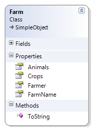
However, more often than not, you’re running into more complex scenarios where additional structuring is necessary. Image your Farm class looks like this:

image

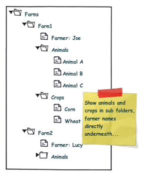
Accordingly, you might want to display that information according to the sketch below:

complextree

Note the difference: We want to organize the Animals and Crops collections within individual sub folders, while the "Farmer" node is a direct child of the "Farm" root node. From the control’s point of view, this means that the "Folder" nodes and the "Farmer" node are siblings.

Now, one solution to that very problem are ViewModel wrapper classes that optimize the business logic for your specific UI logic. This route does work very well for quite a few scenarios. However, sometimes, you just want to have a quick solution. I’ll try to provide one here…

My solution to that very problem requires the following ingredients:

  • A MultiBinding that allows you to combine different bindings.
  • A converter that helps us organizing the different bound collections into sub folders, where necessary.
  • And of course: Data templates that provide a visual representation of your bound data.


Let’s start with the bindings, which are declared within a HiearchicalDataTemplate. You can use a MultiBinding to retrieve all necessary data of a given Farm instance:


<HierarchicalDataTemplate DataType="{x:Type local:Farm}">

  <!-- bind the different data sources -->
  <HierarchicalDataTemplate.ItemsSource>
    <MultiBinding>
      <Binding Path="Farmer" />
      <Binding Path="Animals" />
      <Binding Path="Crops" />
    </MultiBinding>
  </HierarchicalDataTemplate.ItemsSource>

  <TextBlock Text="{Binding Path=FarmName}" />

</HierarchicalDataTemplate>


A MultiBinding always needs a converter of type IMultiValueConverter. Our converter has to provide the following functionality:

  • Allow binding of simple objects (Farmer), or collections (Animals, Crops).
  • Where necessary, put a bound child item or collection into a virtual container object that can serve as a "folder" when it comes to rendering.
  • Provide means to name (or even identify) a folder in order to simplify styling.
  • Render specific child items directly under the parent node (no subfolder). 
  • Return everything as a an object that can be bound to the TreeView.ItemsSource property.


I wrote a simple converter that performs these tasks. The initial declaration looks like this:

 
<MultiBinding Converter="{StaticResource folderConverter}">
  <Binding Path="Farmer" />
  <Binding Path="Animals" />
  <Binding Path="Crops" />
</MultiBinding>
 
…and it produces the following output:

image


Obviously, the data is being parsed parsed and assigned to the "Farm" nodes, but we’re still lacking the desired structure (sub folders for animals and plants). However, this can easily be done by setting the ConverterParameter property:


<MultiBinding Converter="{StaticResource folderConverter}"
              ConverterParameter=", Animals, Cultivated Plants">
  <Binding Path="Farmer" />
  <Binding Path="Animals" />
  <Binding Path="Crops" />
</MultiBinding>
 

The converter parameter allows you to define folders for any of the items that are bound within the MultiBinding, while an empty string inserts a bound item directly under the root item. The converter parameter above produces the following output:

 image


The tree now renders the farmers and four FolderItem instances. FolderItem is a very simple helper class that is used by the converter to store the bound Animals and Crops collections. It provides just two properties:

  • Name (the string that was defined through the converter parameter)
  • Items (the folder’s contents)

Currently, the tree does not know yet how to render a FolderItem class, which is why there’s just the name displayed. What’s missing here is an additional data template for FolderItem:


<!-- data template for FolderItem instances -->
<HierarchicalDataTemplate DataType="{x:Type vm:FolderItem}"
                          ItemsSource="{Binding Path=Items}">

  <TextBlock Text="{Binding Path=Name}" />

</HierarchicalDataTemplate>


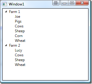
This finally produces our desired output:

image


Simply delegating data organization to the SimpleFolderConverter allows us to individually structure heterogeneous data for our TreeView control with a very simplistic approach. Below is the complete XAML for the sample:


<Window
  x:Class="Hardcodet.Farms.Window1"
  xmlns="http://schemas.microsoft.com/winfx/2006/xaml/presentation"
  xmlns:x="http://schemas.microsoft.com/winfx/2006/xaml"
  xmlns:vm="clr-namespace:Hardcodet.Farms.ViewModel"
  xmlns:local="clr-namespace:Hardcodet.Farms.Model"
  Title="Window1"
  Height="300"
  Width="300">

  <Window.Resources>
    <vm:SimpleFolderConverter x:Key="folderConverter" />

    <!-- data template for Farm instances -->
    <HierarchicalDataTemplate DataType="{x:Type local:Farm}">

      <!-- bind the different data sources -->
      <HierarchicalDataTemplate.ItemsSource>
        <MultiBinding Converter="{StaticResource folderConverter}" 
                      ConverterParameter=", Animals, Cultivated Plants">
          <Binding Path="Farmer" />
          <Binding Path="Animals" />
          <Binding Path="Crops" />
        </MultiBinding>
      </HierarchicalDataTemplate.ItemsSource>

      <TextBlock Text="{Binding Path=FarmName}" />
    </HierarchicalDataTemplate>


    <!-- data template for FolderItem instances -->
    <HierarchicalDataTemplate DataType="{x:Type vm:FolderItem}"
                              ItemsSource="{Binding Path=Items}">
      <TextBlock Text="{Binding Path=Name}" />
    </HierarchicalDataTemplate>

  </Window.Resources>

  <!-- the treeview control -->
  <TreeView x:Name="farmsTree" />
  
</Window>


Of course, you can easily style any of the data templates to your liking. You find the complete sample under the link below. Enjoy 🙂

Download Sample Project (VS2008): farmtree.zip

Author: Categories: WPF, WPF TreeView Tags: ,

A Covariant ObservableCollection for .NET 3.x

November 28th, 2008

When starting with generics, I was somewhat suprised that something like this didn’t work:


public interface IAnimal
{
}

public class Pig : IAnimal
{
}

public class AnimalFarm
{
  private ObservableCollection<Pig> pigs;

  public IEnumerable<IAnimal> Animals
  {
    get { return pigs; } //DOES NOT COMPILE
  }
}


The problem is that generics aren’t covariant, which is sometimes a bit of a problem when working with interfaces. However, while we’re waiting for C# 4.0, there is a poor man’s solution to covariance – the idea is to just expose the required IEnumerable<IAnimal> interface explicitly for the interface. And of course, there’s a generic solution to that problem:


/// <summary>
/// An implementation of <see cref="ObservableCollection{T}"/> that provides
/// an <see cref="IEnumerable{X}"/> interface for a super type of
/// <typeparamref name="T"/>.
/// </summary>
/// <typeparam name="T">The type of items to be stored in the collection.</typeparam>
/// <typeparam name="X">A super type of <typeparamref name="X"/>, for which this
/// collection provides an <see cref="IEnumerable{X}"/> interface, thus providing
/// covariance.</typeparam>
public class HybridObservableCollection<T, X> : ObservableCollection<T>,
                                                IEnumerable<X> where T : X
{

  /// <summary>
  /// Provides enumeration over type <see cref="X"/>.
  /// </summary>
  /// <returns>A <see cref="IEnumerator{X}"/>> that can be used to iterate
  /// through the collection.</returns>
  IEnumerator<X> IEnumerable<X>.GetEnumerator()
  {
    foreach (T t in this)
    {
      yield return t;
    }
  }

}


Note the type constraint: The second type parameter (X) must be convertible to the first one (T), which ensures that you can’t break the collection.

And as a result, we can return the collection as both IEnumerable<Pig> or IEnumerable<IAnimal>:

public class AnimalFarm
{
  //the collection provides both IEnumerable<Pig>, IEnumerable<IAnimal>
  private HybridObservableCollection<Pig, IAnimal> pigs;

  public IEnumerable<IAnimal> Animals
  {
    get { return pigs; } //WORKS
  }

  public IEnumerable<Pig> Pigs
  {
    get { return pigs; } //WORKS TOO
  }
}


Of course, rather than just IEnumerable<IAnimal>, you could easily expose IList<IAnimal> that way, but you would risk runtime exceptions if somebody tried to inject another IAnimal implementation into the base class that is not an instance of type Pig. However, in a safe environment, this might be well feasible if it lets you expose your collections as lists and still stick to interfaces.

Author: Categories: C#, Uncategorized, WPF Tags: