Linked Images in WPF Projects – Bad Idea?

August 10th, 2009

I discovered today that images that are included in a VS project as links are compiled differently than images that are stored as part of the project. This one might cost you quite some time, so here’s a few observations on the issue…

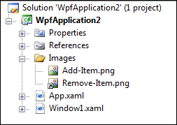
Look at this simple project that contains two image files. One file is part of the project (physically stored in the Images folder), the other one added as a link. Both files have the same build action (Resource):

image


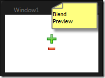
Now, if you declare these two images the same way, everything appears to be fine in the designer (both Visual Studio and Blend):

<Window x:Class="WpfApplication2.Window1"
    xmlns="http://schemas.microsoft.com/winfx/2006/xaml/presentation"
    xmlns:x="http://schemas.microsoft.com/winfx/2006/xaml"
    Title="Window1" Height="150" Width="150">
    <StackPanel VerticalAlignment="Center">
      <Image Source="/Images/Add-Item.png" Stretch="None" />
      <Image Source="/Images/Remove-Item.png" Stretch="None"/>
    </StackPanel>
</Window>


image


However, as soon as you compile and start your application, the linked image does not appear – obviously, the runtime could not resolve it at runtime:


image


I was quite surprised about this until I reverted to Reflector, which reveals that the linked image was embedded differently than the other one. Here’s the resource entries of the compiled WPF application:

image


As you can see, the linked image (Remove-Item.png) was included without the folder name, in lower case. Accordingly, I had to adjust the image source in XAML as follows:

<Window x:Class="WpfApplication2.Window1"
    xmlns="http://schemas.microsoft.com/winfx/2006/xaml/presentation"
    xmlns:x="http://schemas.microsoft.com/winfx/2006/xaml"
    Title="Window1" Height="150" Width="150">
    <StackPanel VerticalAlignment="Center">
      <Image Source="/Images/Add-Item.png" Stretch="None" />
      <Image Source="/remove-item.png" Stretch="None"/>
    </StackPanel>
</Window>


This one works at runtime. BUT it breaks the designer. I’m not too happy about that one – whether a file is linked to or not should not affect the outcome of the compiled build all. I’m not too sure whether this was a conscious decision or a bug, but it sure is a major pain.

Update: Microsoft confirmed this to be a bug, which should be fixed in the upcoming version of the framework / VS2010. So for now, linking is out of the picture for me.
Author: Categories: WPF Controls Tags:

Finding Elements in the WPF Tree – Both Ways

June 25th, 2009

A while ago I posted a helper method to traverse a (visual or logical) tree in order to find an element’s parent of a given type. The corresponding blog entry is here.

This time, I needed to search the other way: I wanted to find all descendants (direct or indirect childs) of a given element that match a given type. As a result, I came up with a complementary extension method that does the job for me:

//get all TextBox controls within the grid:
Grid container;
IEnumerable<TextBox> editors = container.FindChildren<TextBox>();


Usage Sample

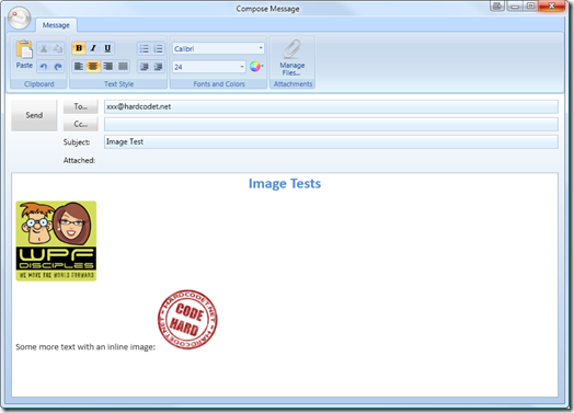
As a sample, let’s use a window dialog which contains several images:

  • Images that were pasted into a RichTextBox control.
  • Images that are part of the UI, nested within the control hierarchy of a ribbon.

editor


In order to find all these Image elements you can see on the screenshot, this will do:

//start a the root (the window itself)
Window window = this;
foreach (Image img in window.FindChildren<Image>())
{
  Console.WriteLine("Image source: " + img.Source);
}


…the above snippet produces the following output:

Image source: pack://payload:,,wpf1,/Xaml/Image1.png

Image source: pack://payload:,,wpf1,/Xaml/Image2.png

Image source: pack://application:,,,/Shared/Images/Ribbon/Paste_32x32.png

Image source: System.Windows.Media.Imaging.FormatConvertedBitmap

Image source: System.Windows.Media.Imaging.FormatConvertedBitmap

Image source: pack://application:,,,/Shared/Images/Ribbon/EditUndo.png

Image source: pack://application:,,,/Shared/Images/Ribbon/EditRedo.png

Image source: pack://application:,,,/Shared/Images/Ribbon/Bold.png

Image source: System.Windows.Media.Imaging.BitmapFrameEncode

[…]


Accordingly, in order to analyze only the contents of the rich text editor, just start on a lower level of the tree:

//only examine the contents of the editor
RichTextBox editor = this.txtContent;
foreach (Image img in editor.FindChildren<Image>())
{
  Console.WriteLine("Image source: " + img.Source);
}


Implementation


(Download link at the end of the posting)

/// <summary> /// Analyzes both visual and logical tree in order to find all elements /// of a given type that are descendants of the <paramref name="source"/> /// item. /// </summary> /// <typeparam name="T">The type of the queried items.</typeparam> /// <param name="source">The root element that marks the source of the /// search. If the source is already of the requested type, it will not /// be included in the result.</param> /// <returns>All descendants of <paramref name="source"/> that match the /// requested type.</returns> public static IEnumerable<T> FindChildren<T>(this DependencyObject source) where T : DependencyObject { if (source != null) { var childs = GetChildObjects(source); foreach (DependencyObject child in childs) { //analyze if children match the requested type if (child != null && child is T) { yield return (T) child; } //recurse tree foreach (T descendant in FindChildren<T>(child)) { yield return descendant; } } } } /// <summary> /// This method is an alternative to WPF's /// <see cref="VisualTreeHelper.GetChild"/> method, which also /// supports content elements. Do note, that for content elements, /// this method falls back to the logical tree of the element. /// </summary> /// <param name="parent">The item to be processed.</param> /// <returns>The submitted item's child elements, if available.</returns> public static IEnumerable<DependencyObject> GetChildObjects( this DependencyObject parent) { if (parent == null) yield break;

if (parent is ContentElement || parent is FrameworkElement) { //use the logical tree for content / framework elements foreach (object obj in LogicalTreeHelper.GetChildren(parent)) { var depObj = obj as DependencyObject; if (depObj != null) yield return (DependencyObject) obj; } } else { //use the visual tree per default int count = VisualTreeHelper.GetChildrenCount(parent); for (int i = 0; i < count; i++) { yield return VisualTreeHelper.GetChild(parent, i); } } }


For your convenience, I’ve put together a simple helper class that contains the helper methods to search for both children and parent elements in the tree:

http://www.hardcodet.net/uploads/2009/06/UIHelper.cs


Happy coding 🙂

Author: Categories: WPF Tags:

Beginner’s Tutorial: 3D Line and Border Effects in XAML

May 28th, 2009

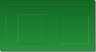
This mini-tutorial might be for you if you’re having troubles finding the right line colors to achieve simple 3D effects like these:

linesamples


The solution to this very problem is actually pretty simple, and it always takes the same three ingredients:

  • A white line
  • A black line
  • Reduced opacity

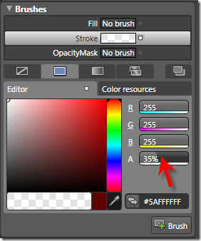
Basically, to get an edged line on a green background, you don’t need to fiddle with different shades of green. Just use white and black lines and play with the opacity. Here’s the settings in Blend for one of the white lines in the above screenshot:

highlighted-line-settings


…and this is the corresponding XAML for the two vertical lines:

<Grid Background="Green">  
  <Path Stretch="Fill" Stroke="#5A000000" Margin="25,62,0,0"
        Width="1" Height="100" Data="M130,176 L130,303.03543"/>
  <Path Stretch="Fill" Stroke="#5AFFFFFF" Margin="26,62,0,0"
        Width="1" Height="100" Data="M130,176 L130,303.03543"/>
</Grid>


Tip: Hiding Blend’s Handles

If you’re trying to format a line, Blend’s handles don’t help much, as the basically hide the whole content:

blend-handles

However – you can easily hide / show them by pressing the F9 button.


Tutorial: Creating a 3D Toggle Button Style

Another usage of white and black lines is a 3D effect for borders. Let’s put this to action and create a reusable style that can be applied to a ToggleButton control:

toggle-buttons 

Rather than joining four lines for each button state, I’ll use two Border controls with the same dimensions for each state, taking advantage that the BorderThickness property can be set independently for every edge. Here’s the borders for the unchecked state:

<Grid x:Name="uncheckedState">
  <Border BorderBrush="#49FFFFFF" BorderThickness="1,1,0,0"/>
  <Border BorderBrush="#49000000" BorderThickness="0,0,1,1"/>
</Grid>


…and here’s the borders for the checked state. Note that its Visibility property of the surrounding grid is set to Collapsed in order to hide the borders:

<Grid x:Name="checkedState" Visibility="Collapsed">
  <Border BorderBrush="#49000000" BorderThickness="1,1,0,0"/>
  <Border BorderBrush="#49FFFFFF" BorderThickness="0,0,1,1"/>
</Grid>  


I put these borders together in a simple style, which uses a trigger to switch the visibility of the two borders as soon as the IsChecked property of the ToggleButton changes:

<Style TargetType="{x:Type ToggleButton}">
  <Setter Property="Template">
    <Setter.Value>
      <ControlTemplate TargetType="{x:Type ToggleButton}">
        <Grid x:Name="mainGrid" Margin="0,0,1,1">
                             
          <Grid x:Name="uncheckedState">
            <Border BorderBrush="#49FFFFFF" BorderThickness="1,1,0,0"/>
            <Border BorderBrush="#49000000" BorderThickness="0,0,1,1"/>
          </Grid>
              
          <Grid x:Name="checkedState" Visibility="Collapsed">
            <Border BorderBrush="#49000000" BorderThickness="1,1,0,0"/>
            <Border BorderBrush="#49FFFFFF" BorderThickness="0,0,1,1"/>
          </Grid>   
              
          <!--
            WPF needs a background to toggle IsChecked
            if the ContentPresenter does not fill the whole area
          -->
          <Border Background="#00000000" />
              
          <ContentPresenter VerticalAlignment="Center"
                            HorizontalAlignment="Center" />

        </Grid>
  
        <!-- triggers toggle visual appearance -->
        <ControlTemplate.Triggers>
          <Trigger Property="IsChecked" Value="True">
            <Setter TargetName="checkedState"
                    Property="Visibility"
                    Value="Visible" />
            <Setter TargetName="uncheckedState"
                    Property="Visibility"
                    Value="Collapsed" />
            <Setter TargetName="mainGrid"
                    Property="Margin"
                    Value="1,1,0,0"/>
          </Trigger>
        </ControlTemplate.Triggers>
      </ControlTemplate>
    </Setter.Value>
  </Setter>
</Style>


With the style in place, you can easily declare a ToggleButton like this:

<ToggleButton Width="100" Height="24" Content="hello world" />

Author: Categories: WPF Tags:

I’m a WPF Disciple

May 27th, 2009

WPF DisciplesI have been invited by the WPF Disciples to become one of their own, which I – of course – gladly accepted.

I feel honored (and a little proud, too) to stand among some of the biggest names in WPF, and I’m looking forward to being part of the discussions within the group. After all, there’s still lots and lots to learn, discover and write about on planet WPF 🙂

Author: Categories: Personal Tags:

WPF NotifyIcon 1.0.1 – Minor Improvements, Major Tutorial

May 15th, 2009

I just posted an upgrade to my WPF NotifyIcon, which adds some minor improvements to the control. The most important one is probably the simplified data binding support for context menus (thanks to Nic Pillinger for the hint), but I also managed to add some polish in a few other areas.


image


Apart from the updated control itself, I completely revamped the sample project. It’s no longer just a showcase but contains various standalone samples which cover all aspects of the control. And last but not least, I published a complementary tutorial on the CodeProject. One could say I was quite busy 😉


Further information and download on the project page:
http://www.hardcodet.net/projects/wpf-notifyicon

Using Attached Events to Trigger Animations in WPF

May 8th, 2009

This is a pattern I applied when implementing the WPF NotifyIcon component in order to provide animation support for popups, tooltips, and balloon messages. The problem I had to solve was the loose coupling between the NotifyIcon and displayed controls:


image

Accordingly, I didn’t know anything about these controls at runtime. Nonetheless, I wanted to provide a communication channel to inform that UIElement that it is being displayed. And I wanted to do it declaratively.

Attached Events to the Rescue

Enter attached events. Just like the better known attached properties, they can be declared in a static class and attached to arbitrary dependency objects. Accordingly, a control X does not need to declare an event itself in order to raise it.

If you are working with Expression Blend, chances are high that you are already using attached events quite often. As an example, the Mouse.MouseDown attached event that lets you trigger an animation if the user clicks on an arbitrary control. And nothing stops you from defining your own custom events 🙂

Creating a Sample Application

Let’s create a simple sample. The scenario is the following:

  • Sometimes, some kind of critical event occurs (simulated through a button click).
  • Every time this happens, we want a “status control” to show an alarm.

We will implement this status control purely in XAML – an attached event will trigger an animation that displays a warning sign:

image


Read more…

Author: Categories: WPF, WPF Controls Tags: , ,