Quick and Dirty (but nice!) ToolTips via Markup Extensions
Note: There’s a follow-up posting to that one that relies on Blend Behaviors.
NetDrives does not rely on styles when it comes to displaying ToolTips, but uses a simple markup extension, that provides the following functionality:
- Displays a nice looking ToolTip rather than just plain text.
- Optional lookup of strings in a resource dictionary to simplify localization.
- Optional title text.
- Very simple declaration.
Here’s what the XAML looks like:
<Image
  Source="..SharedImagesHelpSmall.png"
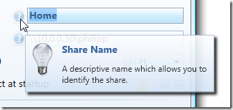
  ToolTip="{ext:Info Title=ShareNameTitleToolTip, Body=ShareNameInfoToolTip}"
  />
…and this is the output:

Creating the Popup Control
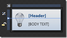
The first step is to create a simple control that contains the ToolTip. Basically, this is a simple UserControl with the following features:
- A grid with two rows. The first row contains just the title and is auto-sized to make sure it collapses if the title is not used at all.
- Two TextBlocks for title and body text.
- An image (I didn’t make that one bindable, I always use the same one).
- Two dependency properties that provide binding capabilities for header and body text.
Here’s what the control looks like in Blend:

Of course, you can easily use this user control through styles and/or directly declared in XAML whenever you need:
<Image Source="..SharedImagesHelpSmall.png">
  <Image.ToolTip>
    <MyToolTipControl Header="My Title" Body="This is a ToolTip" />
  </Image.ToolTip>
</Image>
However, this would still take a style to hide the tooltip border and you are lacking resource file lookups. The markup extension makes this way easier…
Implementing the Markup Extension
MarkupExtension is one of the lesser known stars in WPF – it requires a little coding, but once in place, it greatly simplify things for you. A simple yet brilliant example is Dr. WPF’s ValueConverter extension, and I already blogged a few times about other applications.
This Info markup extension basically provides the following:
- Two properties (Title and Body)
- Resource lookup with fallback mechanism (string is used directly if it’s not a resource key)
- ToolTip creation
/// <summary>
/// A markup extension that returns a
/// <see cref="InfoPopup"/> control preconfigured
/// with header and text information according to the
/// <see cref="Title"/> and <see cref="Body"/>
/// properties.
/// </summary>
public class Info : MarkupExtension
{
  /// <summary>
  /// Either a title text or a resource key that can be used
  /// to look up the title.
  /// </summary>
  public string Title { get; set; }

  /// <summary>
  /// Either a tooltips' main text or a resource key that can be used
  /// to look up the text.
  /// </summary>
  public string Body { get; set; }

  /// <summary>
  /// Empty default constructor.
  /// </summary>
  public Info()
  {
  }

  /// <summary>
  /// Inits the <see cref="Info"/> markup extension
  /// with the title and body.
  /// </summary>
  public Info(string title, string body)
  {
    Title = title;
    Body = body;
  }

  /// <summary>
  /// Performs a lookup for the defined <see cref="Title"/> and
  /// <see cref="Info"/> and creates the tooltip control.
  /// </summary>
  /// <returns>
  /// A tooltip control.
  /// </returns>
  public override object ProvideValue(IServiceProvider serviceProvider)
  {
    //create the user control that
    InfoPopup popup = new InfoPopup();

    if (!String.IsNullOrEmpty(Title))
    {
      //look up title - if the string is not a
      //resource key, use it directly
      var result = Resources.ResourceManager.GetObject(Title) ?? Title;
      popup.HeaderText = (string)result;
    }

    if (!String.IsNullOrEmpty(Body))
    {
      //look up body text - if the string is not a
      //resource key, use it directly
      var result = Resources.ResourceManager.GetObject(Body) ?? Body;
      popup.BodyText = (string)result;
    }

    //create tooltip and make sure only the content is visible
    ToolTip tt = new ToolTip();
    tt.HasDropShadow = false;
    tt.BorderThickness = new Thickness(0);
    tt.Background = Brushes.Transparent;
    tt.Content = popup;

    return tt;
  }
}
Conclusion and Sample
This is only one of several ways to tackle the problem, but I really like that it only takes a single line to have a rich ToolTip in place. The implementation provided here may not completely suit your requirements, but it can easily be tailored to your needs.
The link below points to a sample project that contains both the markup extension and ToolTip control. Enjoy 🙂


